Emotional Variable Typeface for Accessibility (Evta) is my final degree
project. It is a variable typeface family designed entirely from scratch and specifically
crafted to facilitate the understanding of emotional nuances and tones of verbal language for
people with hearing impairments and ASD, mainly in audiovisual environments. The project won a
Bronze Laus in 2024, within Aporta Student category.
ADG Laus Bronze Aporta
The first phase of the project, involving fieldwork, consisted of identifying the relationships between emotions and formal characteristics in a diverse sample of people. Participants were asked to visualise and draw on paper five basic human emotions: joy, anger, fear, sadness, surprise and disgust. For each emotion, each participant drew three compositions, and the only restrictions were the space on the paper (around 10x10 cm per composition) and the use of black, thick-tipped felt-tip pens. These guidelines helped to make the drawings more akin to the final typographic forms in terms of strokes and handwriting, making the extrapolation of drawings into letters simpler and more direct.
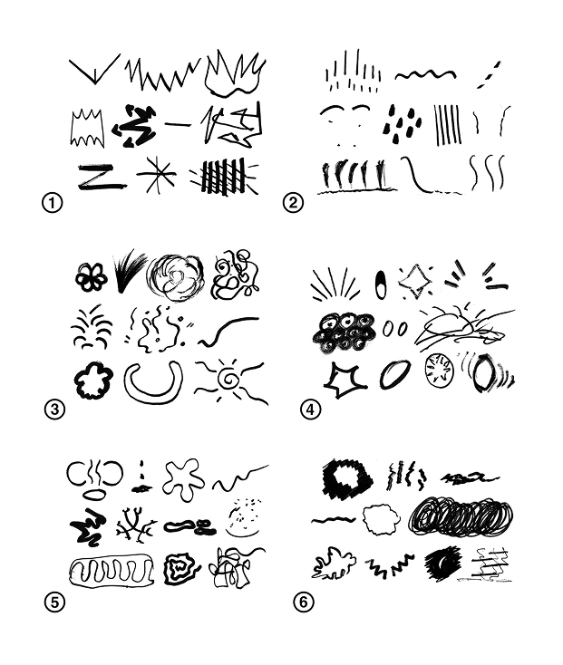
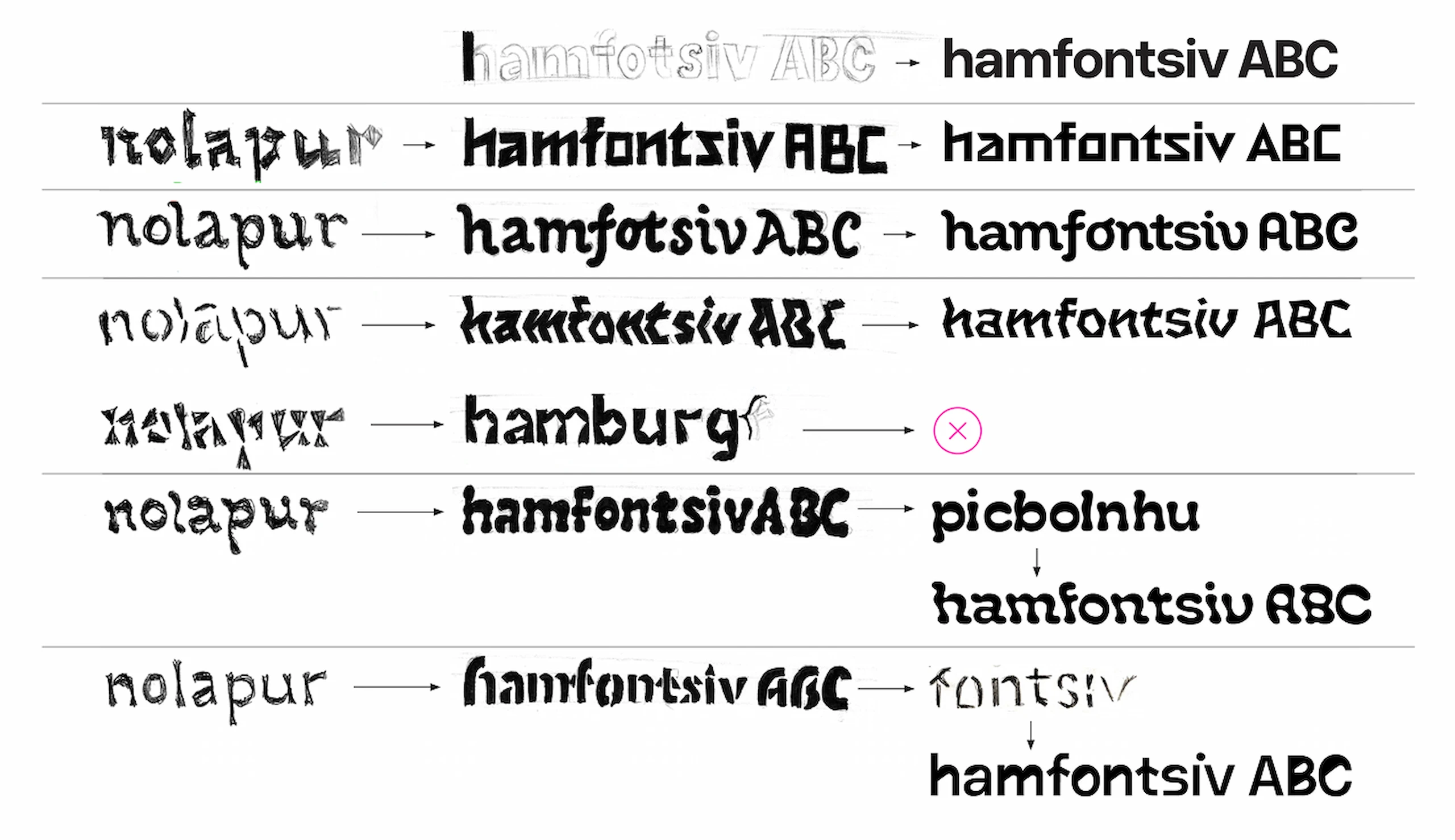
The second phase involved consolidating the information extracted from the drawings. I grouped together the most recognisable and representative drawings for each emotion, and created a questionnaire that asked participants to match emotions with groups of drawings. The results showed that the emotions were clearly distinct and recognisable, although the emotion of surprise tended to be confused with anger. Furthermore, as surprise often manifests itself simultaneously with other emotions such as anger or fear, I decided to remove it from the project.
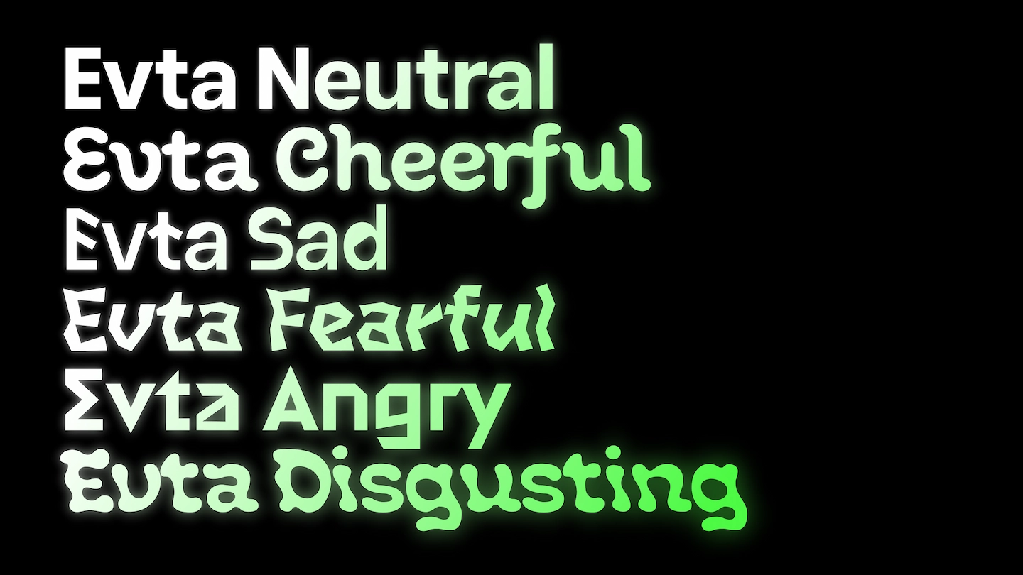
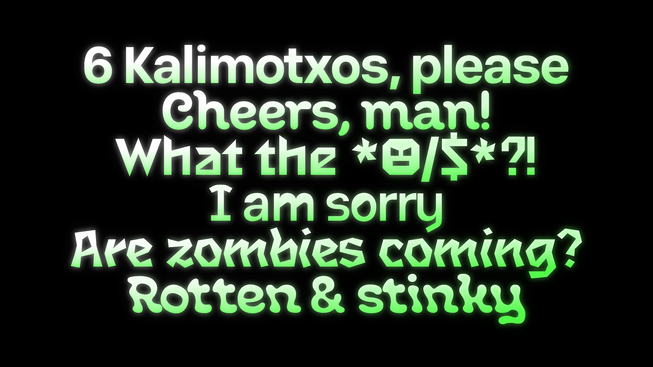
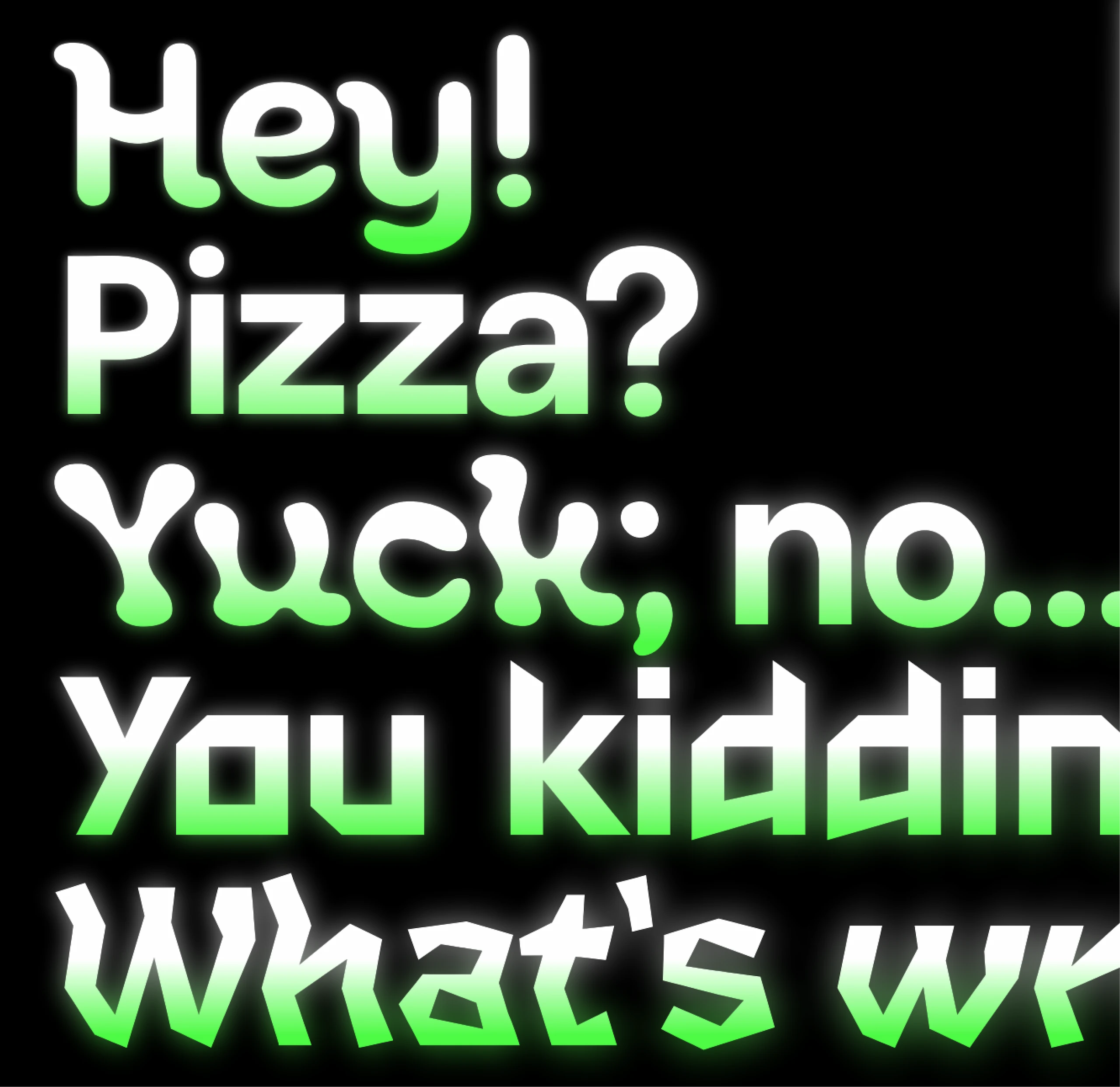
Evta offers 6 distinct styles (Neutral, Cheerful, Angry, Sad, Fearful and Disgusting) and 5 variation axes: Cheerfulness, Anger, Sadness, Fear and Disgust. Each of these variation axes defines the degree of emotion and, therefore, the style applied to the typeface. With no emotion applied—that is, with all variation axes set to 0—the Neutral style is displayed. As the value of an emotion is increased, the shape of the letters evolves towards that specific style. The midpoints resulting from the interpolation between the minimum and maximum values can therefore be used.
All the typefaces within the Evta family share four characteristics that ensure their legibility and distinguish them across a variety of audiovisual media. Firstly, they are designed with details that help distinguish between letters. Generally, they have a thick outline that ensures visibility against visually busy backgrounds. Thirdly, it has a high x-height to ensure it remains legible at small sizes. Finally, it features details that allow styles to be distinguished from one another, such as broken ascenders, slanted crossbars or curved, rounded strokes.
The main idea is that Evta could be applied to subtitles for dialogue, displaying fluctuations in the emotions conveyed in real time. In this way, it could help people with hearing impairments, ASD or attention deficit disorder to understand the non-verbal nuances of communication in audiovisual media.
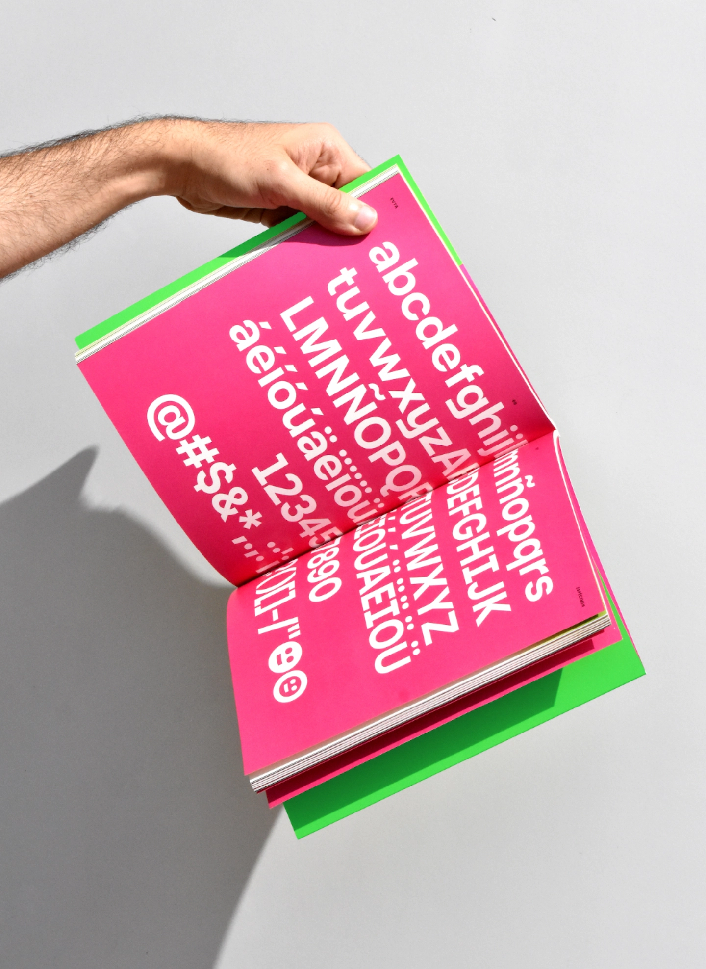
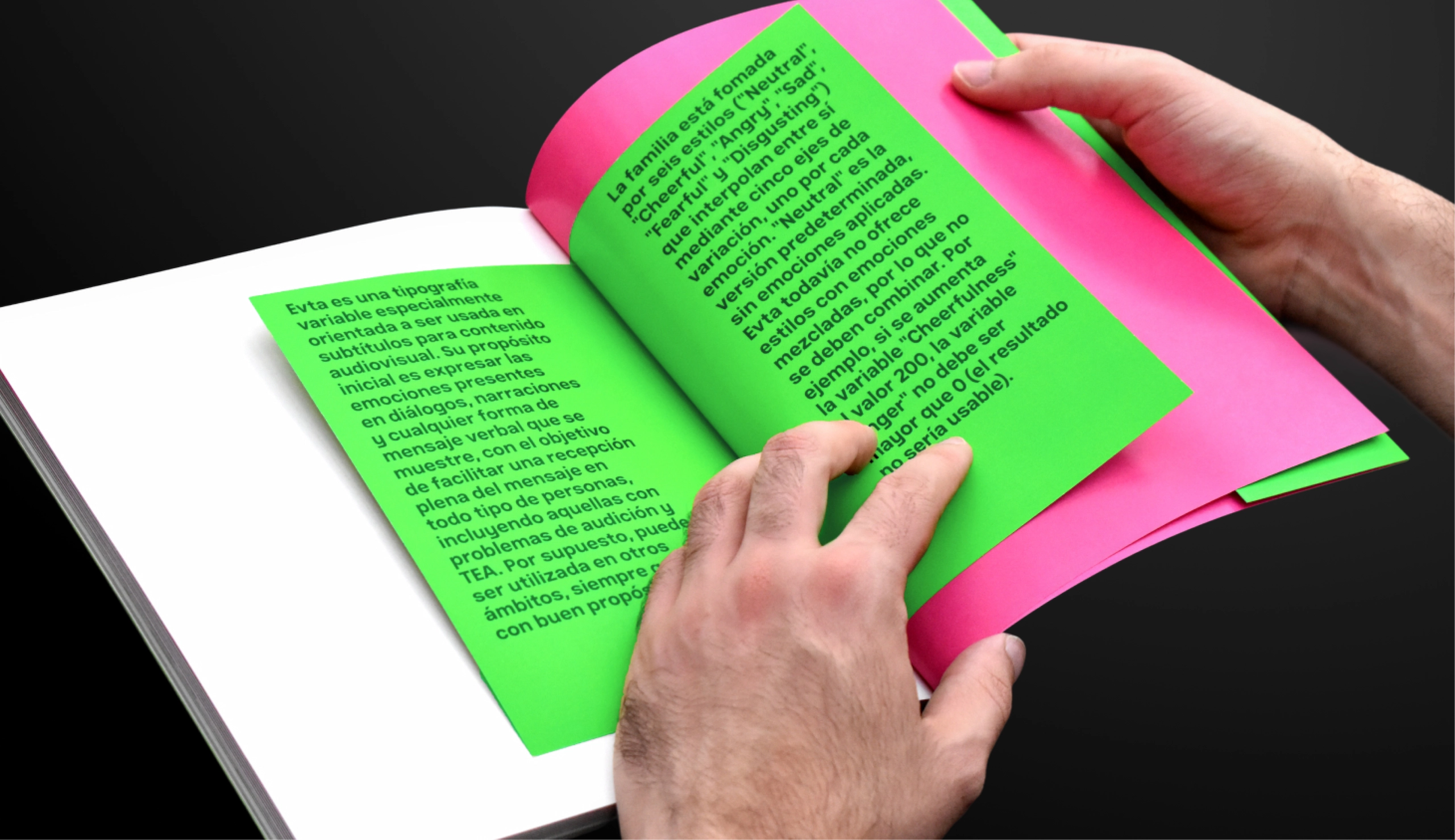
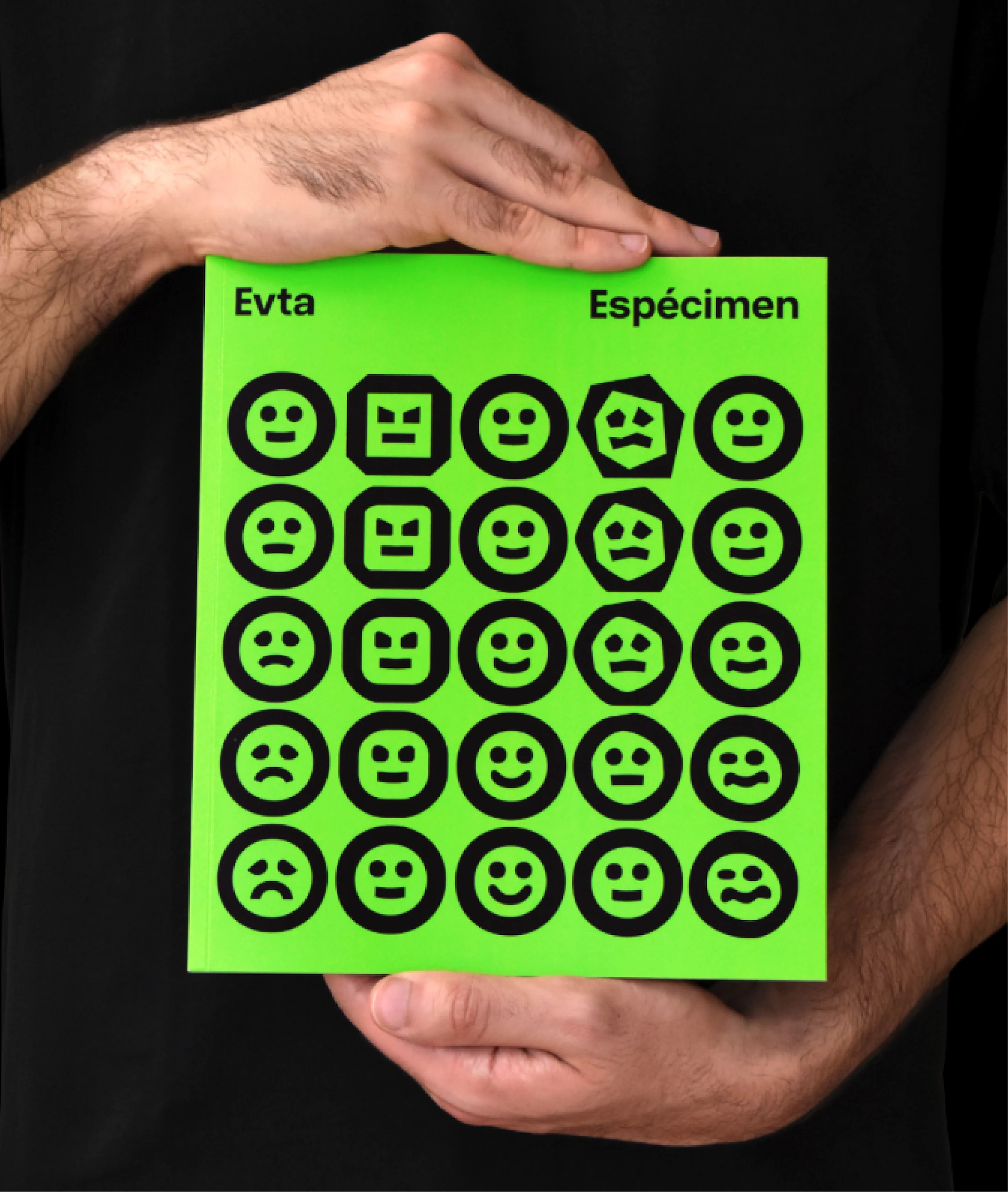
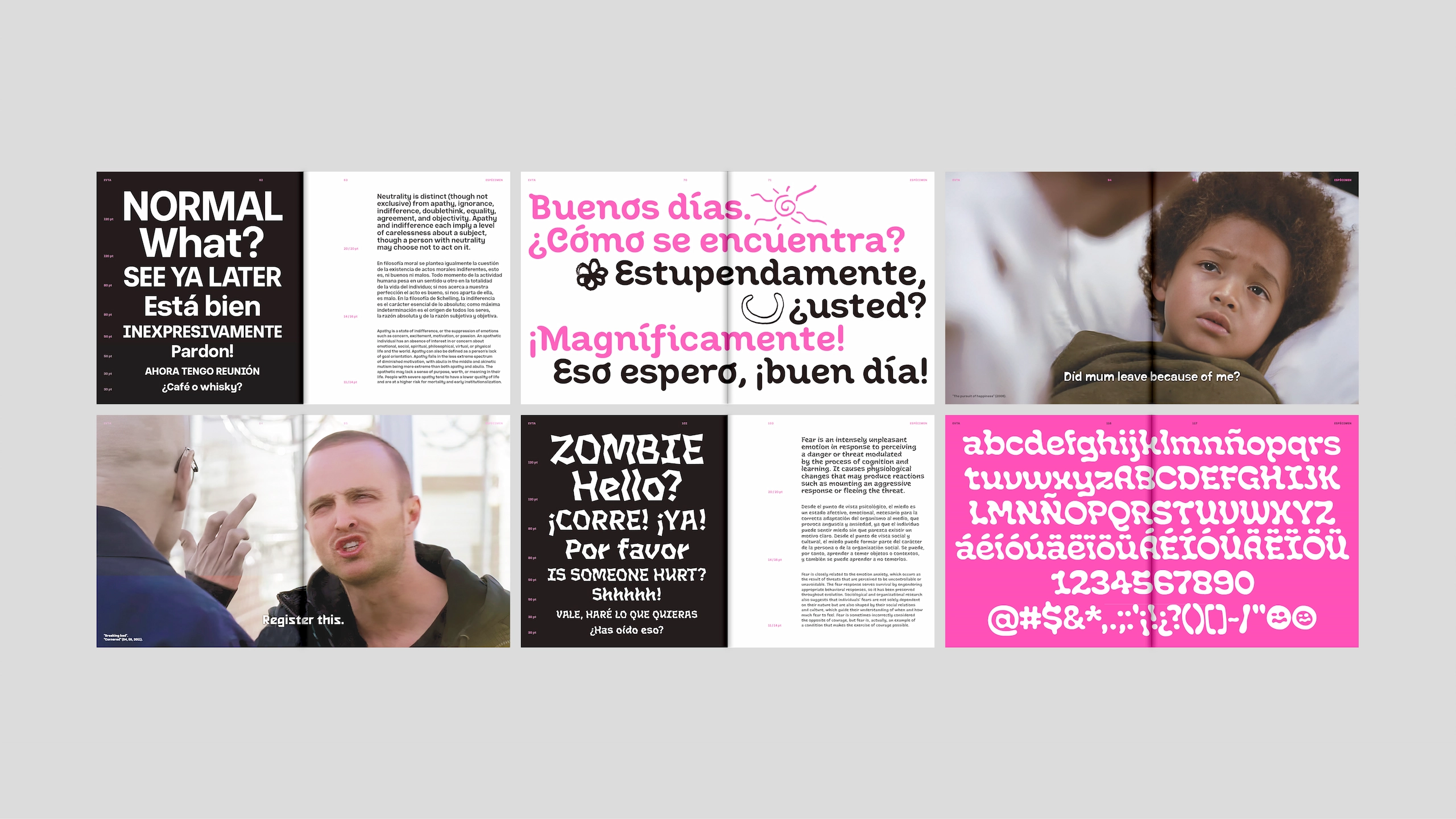
Using a simple yet vibrant colour palette, Evta’s visual identity brings the entire project together under a modern, optimistic aesthetic focused on the worlds of audiovisual media, design and motion graphics. To present the project through engaging touchpoints, I designed a printed brochure, a microsite and several explanatory and promotional videos. In this way, Evta reaches out to people who might be interested.