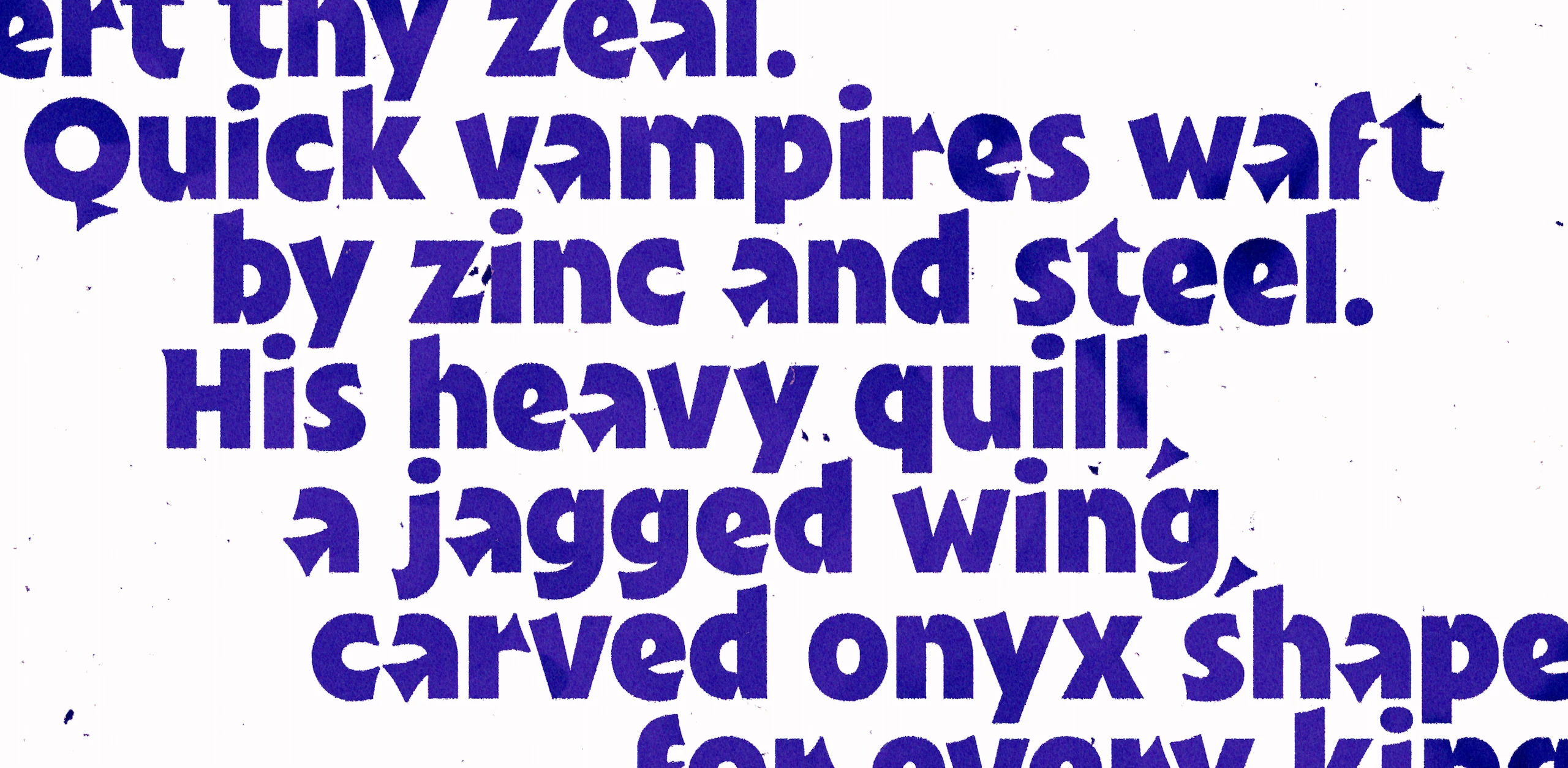
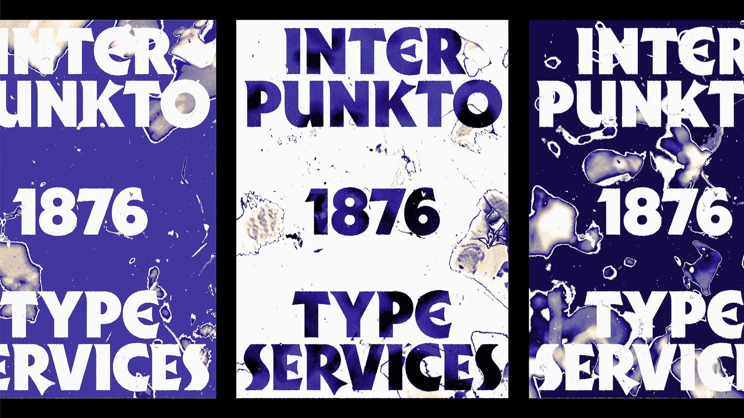
In 2024, I attended Glíglifo, a type design course taught by Pedro Arilla and Damià Rotger in Sos del Rey Católico, a small village in Zaragoza, Spain. There, I had the opportunity to learn the process of designing a typeface from scratch in a crash course, as well as meeting people who were truly inspiring both professionally and personally. Punkt is the result of that week of work and invaluable learning.
Punkt draws inspiration, on the one hand, from blackletter calligraphy styles and, specifically, Rudolf Koch’s Neuland typeface; on the other hand, from Roman square capitals, which exemplify proportion, balance and monumentality. In the latter, I focused on the interpunct, from which Punkt takes its name. This middle dot, which in many inscriptions appears in a triangular shape, features in several letters, constituting a defining element of the typeface's identity.
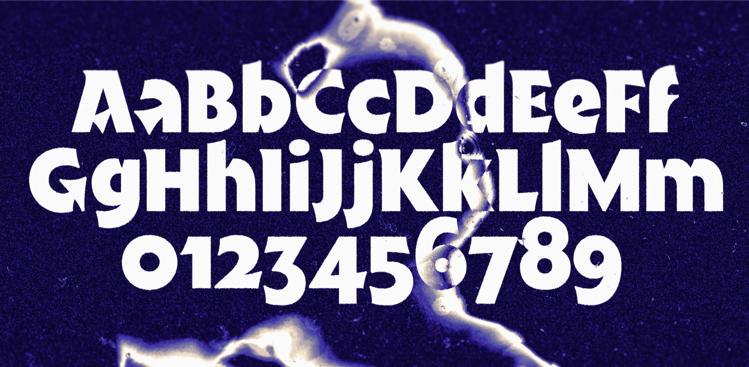
The thick strokes produce bold lines of text, whilst the pointed terminals create an interplay of sharp, intersecting forms that lend Punkt an antique, dark and fanciful air. Furthermore, stylistic alternatives are included that accentuate these features and lend it greater character in display applications such as posters or large headlines.